

Brief
Brief
Design a visually compelling double-page print spread for DesignJam magazine, showcasing Wolfgang Weingart’s influence on Swiss typography and his rebellious approach to grid-based design. The project extends into adaptive digital layouts for mobile, tablet, and desktop, ensuring a cohesive experience across print and digital platforms.
Design a visually compelling double-page print spread for DesignJam magazine, showcasing Wolfgang Weingart’s influence on Swiss typography and his rebellious approach to grid-based design. The project extends into adaptive digital layouts for mobile, tablet, and desktop, ensuring a cohesive experience across print and digital platforms.
Brief
Design a visually compelling double-page print spread for DesignJam magazine, showcasing Wolfgang Weingart’s influence on Swiss typography and his rebellious approach to grid-based design. The project extends into adaptive digital layouts for mobile, tablet, and desktop, ensuring a cohesive experience across print and digital platforms.
Approach
Approach
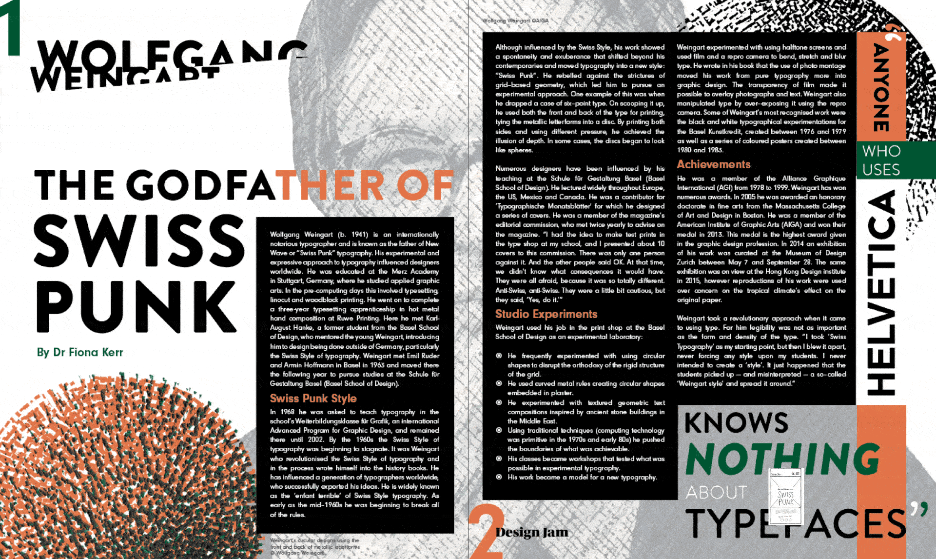
Inspired by Weingart’s experimental yet structured style, I explored bold typography, dynamic layouts, and halftone textures. Researching his signature use of justified alignment, small type sizes, and playful disruptions within the Swiss grid, I refined a high-impact layout balancing readability and visual energy. Supporting colours, drawn from archival images, add depth while maintaining the black-and-white foundation.
Inspired by Weingart’s experimental yet structured style, I explored bold typography, dynamic layouts, and halftone textures. Researching his signature use of justified alignment, small type sizes, and playful disruptions within the Swiss grid, I refined a high-impact layout balancing readability and visual energy. Supporting colours, drawn from archival images, add depth while maintaining the black-and-white foundation.
Approach
Inspired by Weingart’s experimental yet structured style, I explored bold typography, dynamic layouts, and halftone textures. Researching his signature use of justified alignment, small type sizes, and playful disruptions within the Swiss grid, I refined a high-impact layout balancing readability and visual energy. Supporting colours, drawn from archival images, add depth while maintaining the black-and-white foundation.
Solution
Solution
Solution: The final design integrates Swiss grids with expressive typography, creating a rebellious yet structured visual narrative.
Print Layout: A bold double-page spread using geometric sans-serif fonts, layered imagery, and structured yet unconventional composition.
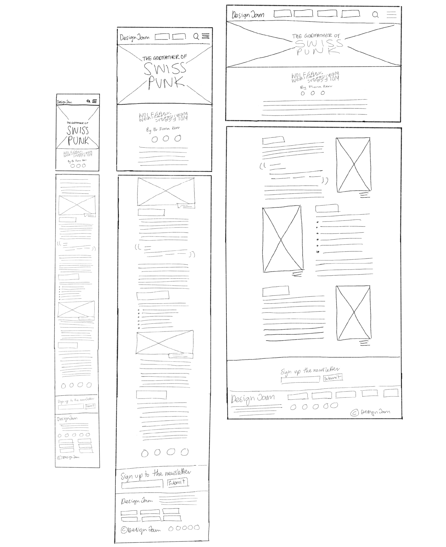
Digital Adaptation: Web-friendly typography, responsive layouts, and optimised imagery ensure a seamless transition across devices.
Consistent Elements: Unified title placement, black bar graphic accents, and a cohesive approach to subheadings and quotes create a strong visual identity.
This design captures Weingart’s spirit, honouring his legacy while engaging modern audiences.
Solution: The final design integrates Swiss grids with expressive typography, creating a rebellious yet structured visual narrative.
Print Layout: A bold double-page spread using geometric sans-serif fonts, layered imagery, and structured yet unconventional composition.
Digital Adaptation: Web-friendly typography, responsive layouts, and optimised imagery ensure a seamless transition across devices.
Consistent Elements: Unified title placement, black bar graphic accents, and a cohesive approach to subheadings and quotes create a strong visual identity.
This design captures Weingart’s spirit, honouring his legacy while engaging modern audiences.
Solution
Solution: The final design integrates Swiss grids with expressive typography, creating a rebellious yet structured visual narrative.
Print Layout: A bold double-page spread using geometric sans-serif fonts, layered imagery, and structured yet unconventional composition.
Digital Adaptation: Web-friendly typography, responsive layouts, and optimised imagery ensure a seamless transition across devices.
Consistent Elements: Unified title placement, black bar graphic accents, and a cohesive approach to subheadings and quotes create a strong visual identity.
This design captures Weingart’s spirit, honouring his legacy while engaging modern audiences.

More Works More Works
More Works More Works

©2024 HANNAH WORRALL DESIGN
Go Back To Top
©2024 HANNAH WORRALL DESIGN
Go Back To Top
©2024 HANNAH WORRALL DESIGN
Go Back To Top
©2024 HANNAH WORRALL DESIGN
Go Back To Top